

The Lingvist learning hub
As the functionality within Lingvist increased and became more complex, it became apparent that users needed a single place where they could manage their content, view their progress, and get motivated to continue learning.
ROLE:
Lead designer & product manager within a cross-functional squad for Lingvist, a language learning application.
The Problem
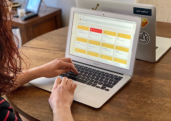
The Lingvist home screen was no longer communicating the core functions of the app.
Following user feedback, we had recently developed 3 new features: dedicated courses; personalised content; and a new way to stay motivated. All were hard to find and getting very little traffic.


THE PROCESS
Problem recognition & validation
Data showed that new features were being used by only a minority of users. On conducting remote interviews with habituated users, we discovered that most had either failed to encounter or forgotten about the functionalities, yet saw value in them.
Wireframes and initial prototype
The insights from the user interviews directed us to focus mainly on the home screen. Wireframes were created and used as a basis for internal testing that focused on usability and information hierarchy. This, in turn, fed into the development of an initial prototype for external testing.
Usability testing
Considering the prominence and importance of the home screen as part of the general user experience, we decided to conduct usability testing on both existing and new users prior to each release. Every round of testing provided further insights and led to shifts in interface architecture.
A/B test against the status quo
The new feature was initially released on one client (Android) as part of a 60/40 split A/B test (weighted towards the status quo). The test was monitored closely over 28 days with tweaks and minor iterations being made before a general release across all platforms.


The Outcome
Based on the research conducted, we were confident the recent core features would provide high value and wanted to make sure they had all the opportunities possible to do so. These included dedicated courses to supplement the existing general language course, a new structure to aid with user habituation and goal-setting, and a unique feature that let users create their own content.
By optimally structuring the home screen to better expose these features, we saw the usage of them increase dramatically (upwards of 200%), which in turn led to bumps in both retention and conversion. With increased use, we also got an influx of user feedback for these features, allowing us to continuously iterate and improve on them.